All SEO
  SEO News
  SEO Strategy
  Ask An SEO
  Enterprise SEO
  Google Algorithm Updates
  International SEO
  Link Building
  Local SEO
  Mobile SEO
  On-Page SEO
  Technical SEO
  Vertical SEO
  Wordpress for SEO
  Web Dev for SEO
  SaaS SEO
  E-commerce SEO
  AI-Driven SEO
W3C Unveils A New Evocative Logo

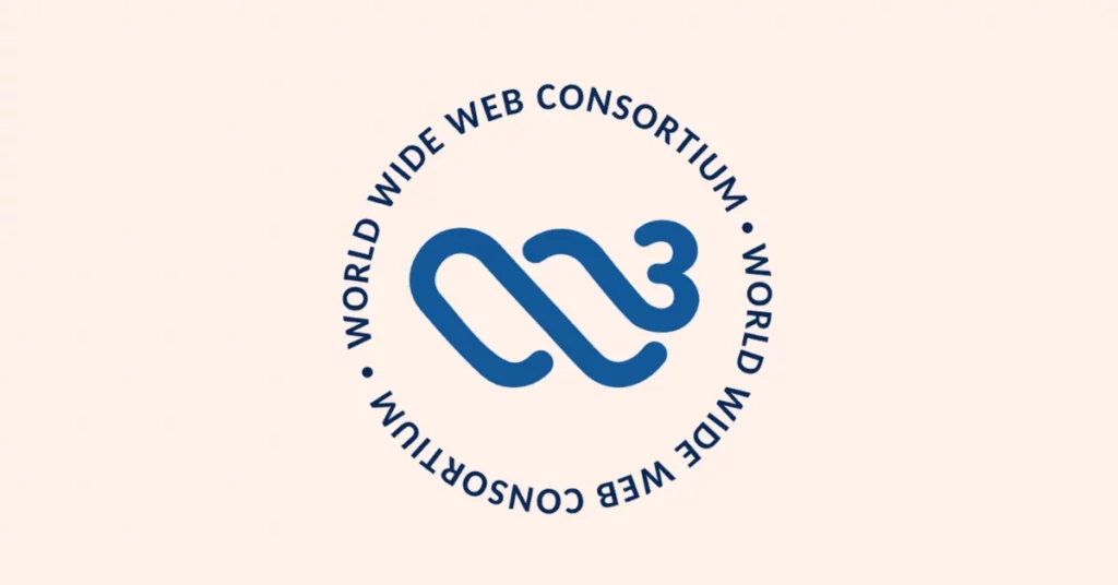
The W3C unveils a new, evocative logo that symbolizes innovation, openness, and the evolving spirit of the web’s global standards community.
The W3C has announced a new logo, which is a deliberately provocative design intended to transcend verbal language. The redesigned symbol shifts its focus from letters to a symbol with connotations of timelessness, unity, and global connection.
A Logo That Transcends Language Families
Although the original logo drew attention to “W3C,” which worked reasonably well in English-speaking contexts, it had limited accessibility for users worldwide who use other scripts or languages written from right to left.
The W3C explains:
“We moved from using distinct letters and numerals in the logo to creating an abstract symbol to represent W3C. We chose a forward-looking style that transcends a single language family. This approach emphasizes W3C’s worldwide connection.”
This approach highlights the organization’s broad international reach and diverse community.
Meaning Behind the New Symbol
The core of the logo is a circle, a symbol of unity, infinity, and continuous movement, representing the benefits of future progress. Inside this circle is a coil, rich with stacked metaphors.
Screenshot Of the New W3C Logo
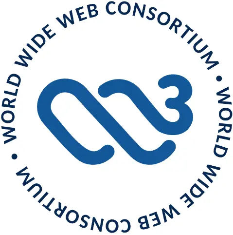
Here is how the W3C itself describes it:
“This circle depicts unity, constant motion, and moving forward. The symbol is a coil, inspired by the concepts of completion and progress reflected in our work. To some, the coil evokes waves — to others, a hand, or the spiral structure of a DNA helix. It has a curl that resembles a heart. This imagery communicates that W3C is the ‘DNA at the heart of the web’.”
We could read it as a truly polysemic design, allowing readings scattered along a vertical spectrum depending on the perspective.
A Poetic Expression of Mission and Values
The rebrand is complemented by a video that explains the work W3C has to do to ensure the web is accessible, inclusive, internationalized, private, and secure. The organization describes itself as:
“From the very beginning, from a single dot to a complex system, we are open, we are human, we are innovative, we are inclusive, we are for you, we are for everyone.
We champion accessibility. We champion internationalization. We champion privacy. We champion security.”
As the digital ecosystem becomes more global and diverse, the logo change represents the W3C’s understanding of how visual language and symbols matter, particularly in the context of inclusivity.
Bottom Line
The new design is not just a brand refresh but a clear signal of W3C’s evolving role and ambitions as a nonprofit championing the open web.
Read more about the new logo at the W3C here: